

I hope it’s on time.
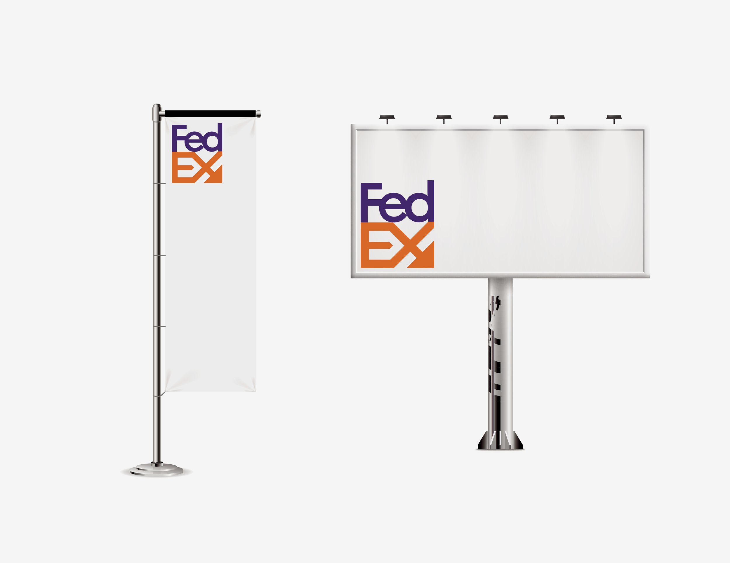
Tasked with taking an existing brand to refresh, I was given the company Fedex. After looking into what made the fedex brand good, and what made it not good. I had to come up with a new logo. Something that had both Demonstrated speed and reliability, while also trying to introduce a people-centric value into the brand. I had come up with a brand mark that better featured the arrow as well as keeping the original brand colours, and something that will work on many different applications. The logo had been designed to be expanded to very large sizes, and also for very small scale. This will keep the brand system consistent and clear throughout all forms it is applied to. I see this as a what if project, rather than a full replacement of their current logo.
